Week 38: Painting an Impression
Welcome to Week 38 of the 52-Week Art Journal Journey. I’m Melinda, and I’m here to encourage you to reclaim your creativity and establish a healthy habit of creative self-care through my simple form of art journaling.
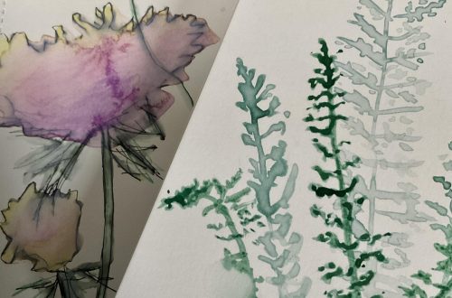
I’m experimenting again, and inviting you along through my first try at sketching a wildflowery photo… with paint… and then sharing how you can create some fun and lovely wildflower and flower-gardeny effects with a few different tools.
I’m using one of my Instagram photos I love, from one of my favorite places, and am getting out the craft acrylic paints. Use what you have, and what works for you. I’m using the craft paints to once again show that reclaiming your creativity doesn’t need to be expensive.
I’ve chosen colors like those in the picture.
We’ve used the outdoors to sketch in nature a few times this year.
You can check out those prompts here:
Week 17: Taking a Closer Look from a Step Back
Week 22: Sketching Perfect Imperfection
Week 35: Capturing Shadows
And I’d intend to use a reference photo to make a hand-painted cut-paper piece of small art. But this week I’m experimenting with layering paint, to basically create a sketch, an impression. It’s not really impressionism, but we need to choose the details that will give our picture the feel of the photo we’re working from, while not being an exact representation.
Relax. You don’t need to precisely recreate your photo.
I like to work in layers. And that’s how I’m approaching this. So first I lay down dark gray and golden brown to give the impression of the rocks that these wildflowers are growing up through on a cliff overlooking Lake Ontario. One reason I like layers is underpainting can create more depth or warmth. Instead of with just white showing through.
As we lay down a background, we also deal with the dreaded blank page.
This post is, for the most part, basically a transcript of this week’s video. It’s impossible to succinctly describe the process in just words, or even words with lots of pictures. Lots of pictures may have done an okay job, but I don’t have time for that. So you may want to watch the video now.
After I lay down a rocky background, I need some yellow-greens.
I start with a grassy green that’s called Holiday Green, which is similar to what’s predominant in my picture, along with some lighter highlights.
I meant to tape off my edges, which I encourage you to do if you like nice clean edges, and to also protect other pages. I’d decided to tape off a nice small square, the shape and size of my photo. But when it came time to film, I just went for the whole page.
I added some black, to create the darker shadowy green.
I have some areas where there are wider leaves, and I have some narrow stems, so I need some different size brushes.
You can work from any image you’d like. We don’t have to give every detail. We want to create the impression, not capture every detail.
Most of the vertical things I have are a light green. But it looks like I should give an impression of more of the darker shorter greenery behind them. I have an awful lot of rocky space showing.
And this is where I realize my background may be a little dark.
These greens are like a second layer of background.
I really struggle with painting with greens. I struggle to find something that I like, or that looks natural to me. Whenever I use reds I feel like I end up with something that looks more like it could be a murder scene. Reds are not my thing. Not my strength? I don’t know. But that’s getting a bit off-topic.
One thing I’m enjoying with my step-up from craft acrylics is using a limited color palette and creating my own mixes and not using greens straight out of a tube or bottle.
And I’m mixing a littler here.
A little too much black, but, yes, rolling with it.
Going a little overboard with the black. But it’s all good.
Some of you may be looking at this and thinking, “What a train wreck” but that’s okay. We learn by doing. And I am definitely doing.
Remember that your art journal is a safe place to explore and experiment without fear of what others will think. It’s as private as you want it to be. I put mine out there to encourage you to reclaim your creativity. If you decide to share your small art, tag me, melindavanry on Instagram, and melindavanrydesign on Facebook. I’d love to see what you’re creating! You can also use #artjournalwithmelinda.
If you’d like to be part of a small private community in which to safely share your small art, be encouraged, and encourage others, click here to sign up for weekly emails and an invitation to join the private Art Journal Journey Facebook group.
The pink in this picture isn’t quite like any of the pinks I have in my craft paints. It’s rather like the Quinacridone Magenta I have in my Liquitex Basics. This is nice, but it needs to be a little darker…
A little too much paint for what I was going for.
One thing I had already decided was to add more of each type of flower. Because I can.
These yellow flowers are beginning to look kind of like irises I have. That would be a fun way to transform this. It starts as one thing and then becomes a patch of irises. I really like that idea… So, let’s see… how can we play up the iris look here? Bearded irises tend to have a center and a little skirt, and little things up to the side… What else is fun?
Probably transform those pinks into a little more purple probably…
So, here’s an example of how you can start with one thing when you need some inspiration. And sticking with that thing is great, but there’s nothing wrong with exploring something new, especially in your art journal.
I liked the irises better when they were looser, and now I’m getting too caught up in the iris form, so I need to back off a little bit and recapture some looseness. Give more of an impression. Because now I have all of these big flowers that are creating a foreground… in the wrong spot for the foreground… but, anyway…
Time to add some purple to that pink. But I do like the idea of having some of the little pink flowers from my photo. These, like I mentioned earlier, look too large for the pink, but I’m going to add some more pink flowers later. After creating the impression of some purple irises.
Irises may be my favorite type of flower. I’ve kind of collected different types of irises over the years. One way was when I used to go to an annual plant sale at a church in a nearby town, where they typically gave away a mystery iris with each purchase.
The yellow on the purple irises definitely got away from me.
I think it’s a good time to get out my piece of kitchen sponge. If you use a kitchen sponge, remember that if you have the kind that come sort of damp in a plastic package, then dry out, you should dampen it. My lines were a little harsh. But they’re also pretty dry, so I’m going to try to soften things up. The sponge may not have been the best choice here, but that’s okay. My paint-sketch is still a little damp from the sponge. Softening up my harsh stems…
I’m thinking I may still add some daisies. You know what, why not? Time to find the white…
Should’ve used a smaller brush for the daisies. And this brush is in rather rough shape. Got some nasty bristles going on.
Some little pink flowers as I mentioned…
And the hearts of the daisies…
More pink flowers…
Add details that feel right to you
What can you add that will make you smile?
I’ll be back next week another small art and journaling prompt. Until then, have some fun painting a sketch and checking our or revisiting past prompts. And don’t tune out just yet, there’s a bit more to help you figure out how to create some wildflower and flower-garden effects next.
If you’d like, before you get started on your sketch, take some time to experiment with your tools to see how you can create effects you’d like to capture in your painting…
I would like to capture details like the collage paper in this video in another more Impressionistic flower-garden painting at another time:
Week 23: A Page from Eric Carle’s Books
I actually found the background in my sketch a little too heavy.
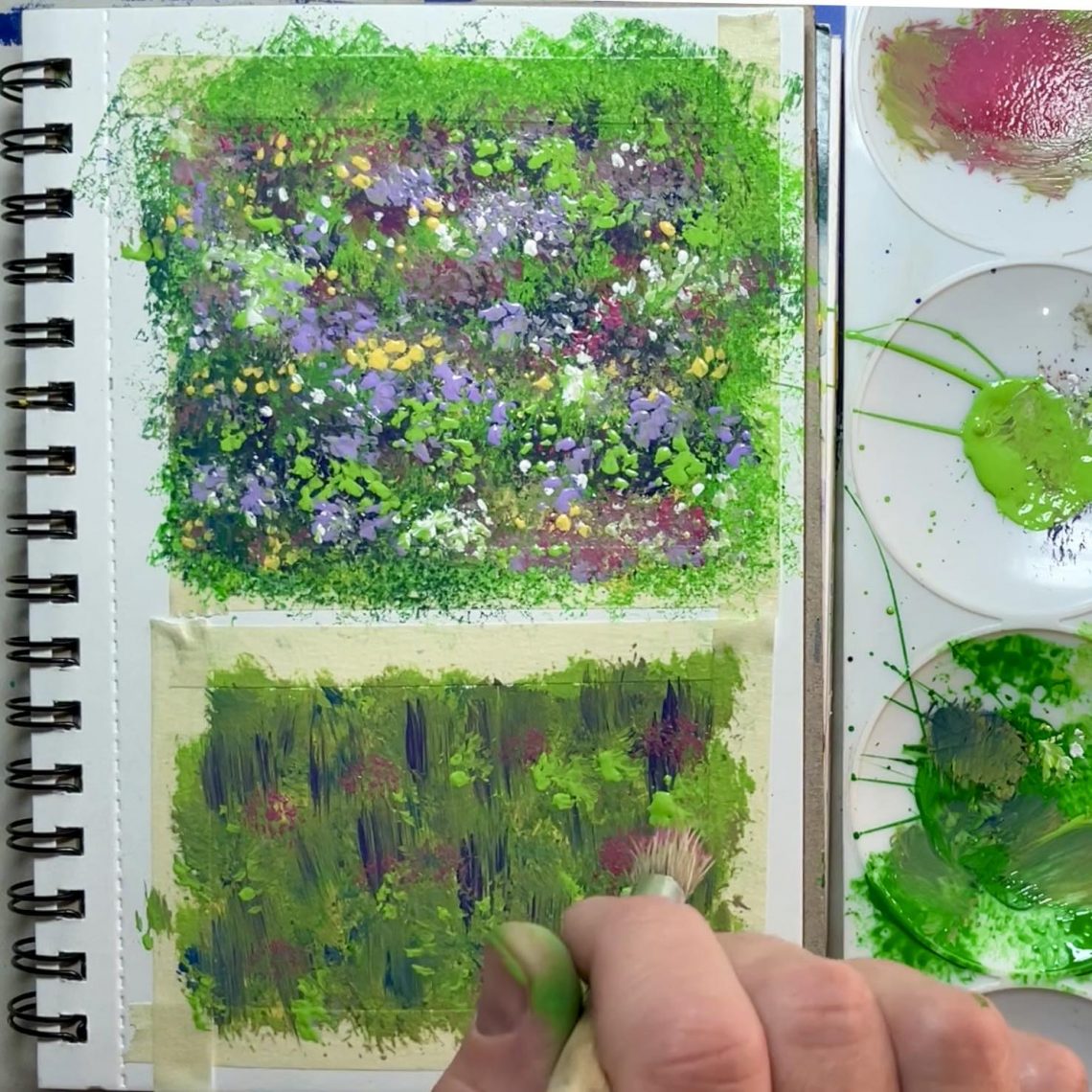
Here’s a sponged background with multiple shades. Followed by rolling a brush (I love doing this) for patches of pink flowers, a raggedy round brush for another type of flower, which, yes, it probably would have been a good idea to go darker first… A tiny brush for delicate white flowers… and back to a raggedy dry brush for some leaves because they wouldn’t all be in the background… and then for some light purple flowers because it needed some more lightness… and more details that just seemed right… including yellow… Liking it.
One thing I noticed, though, that with the wildflowers around here, the darker purple flowers are often tall. So I decided to do a little with that, too. Again the raggedy brush for the texture like patches of flowers and leaves. But using it a little differently for the taller flowers. I like the other flowers I added, but they shouldn’t have been put over the tops of the purples, just the bottom of the lines that give their impression… Short flowers don’t grow out of the tops of tall… but that’s okay, it’s an experiment. And I learned from it.
Here’s what you can do with just a sponge.


You May Also Like
What is the 52-Week Art Journal Journey?
Week 40: Beautiful Blobby Pumpkins