Week 23: A Page from Eric Carle’s Books
It’s Week 23 of the 52-Week Art Journal Journey. This week we’re getting back into the colors, and finding inspiration in the pages of picture books by Eric Carle. If you haven’t perused any of his books in a long time, or if you’ve never had a chance to enjoy them, I recommend checking some out at your local library… which is what I did at the library where I work.There are many enjoyable artists on the shelves of libraries’ chidren’s sections.
As I’ve started to think more about what it is about various pieces of art and artists’ styles that draws me in, two big things are color and texture. So of course Eric Carle is among my favorites.
Check out this week’s video, or his books, or at least search online to see what I mean. If you’d like the video before the text, scroll on down…
I figured that before we take on designing our own hand-painted cut-paper art pieces from our own photographs, we could learn from an expert
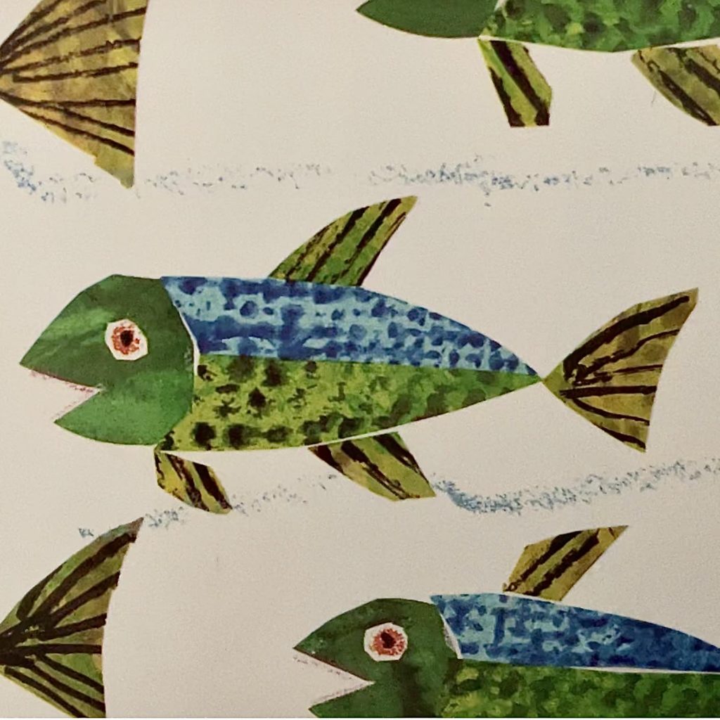
I also figured his basic style of fish in “Rooster’s Off to See the World” and “A House for a Hermit Crab” is a good place to start, with a basic layout of relatively simple shapes. If you’d like to make a more complex creature, you’ll have to consider things like proportion of limbs to body, and the areas of large muscle that make them move… along with colors and texture.
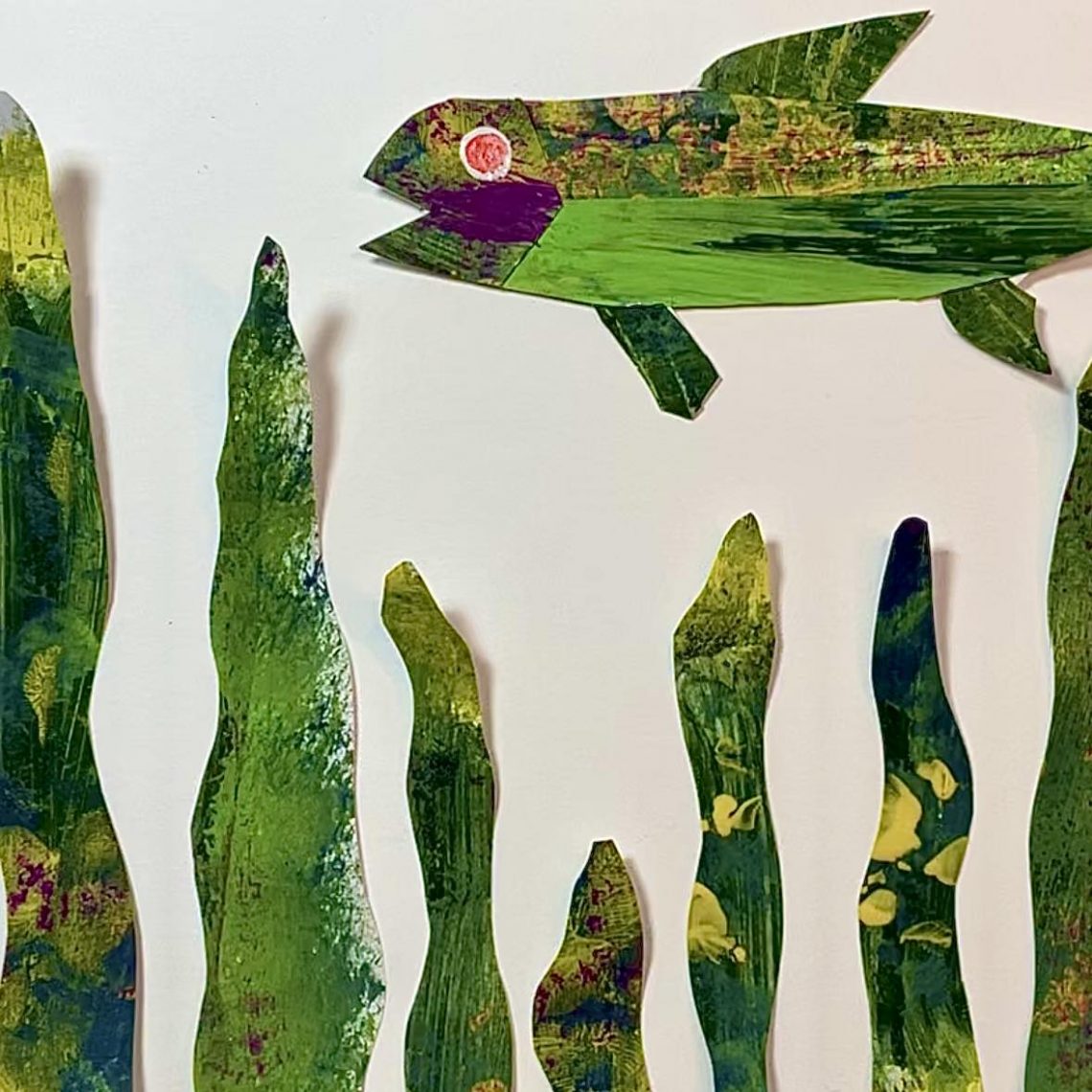
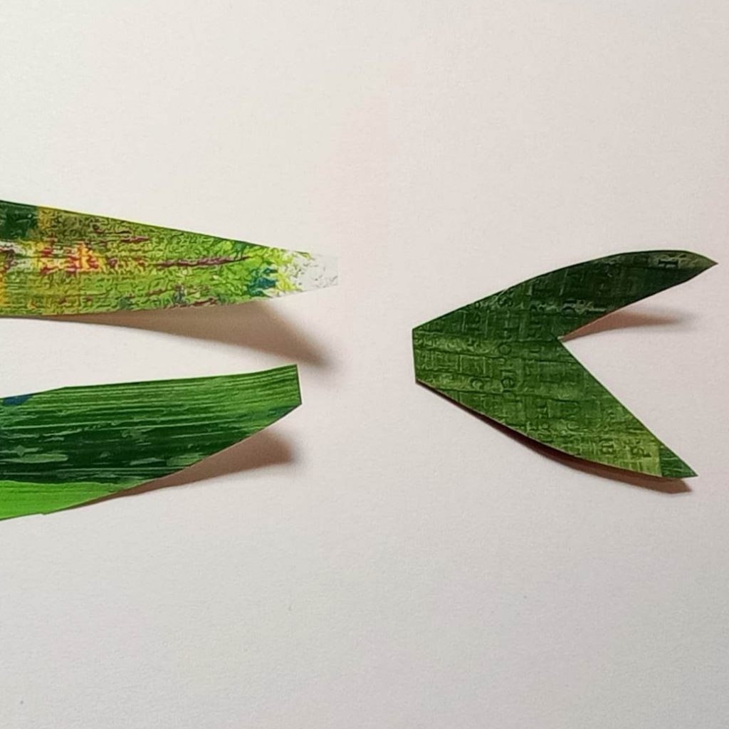
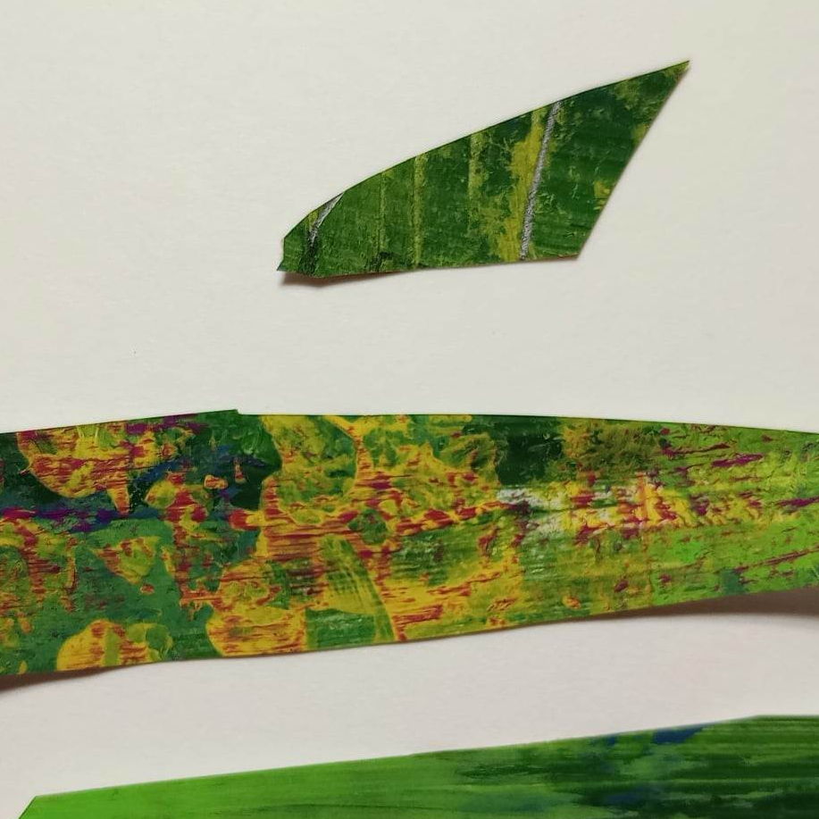
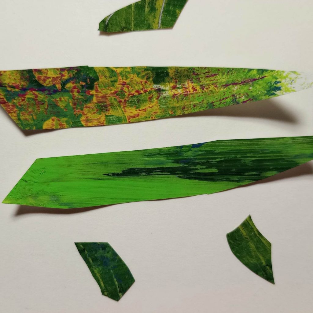
In the simpler fish he used four pieces for the bodies, and different fin layouts.
You’ll have to decide how you’d like to lay out your page, and how many fish you’d like to make. Will they all be the same size or different? Or will you make just one?
Knowing how many fish you’re going to make gives you a rough idea of how much painted paper you’ll need.
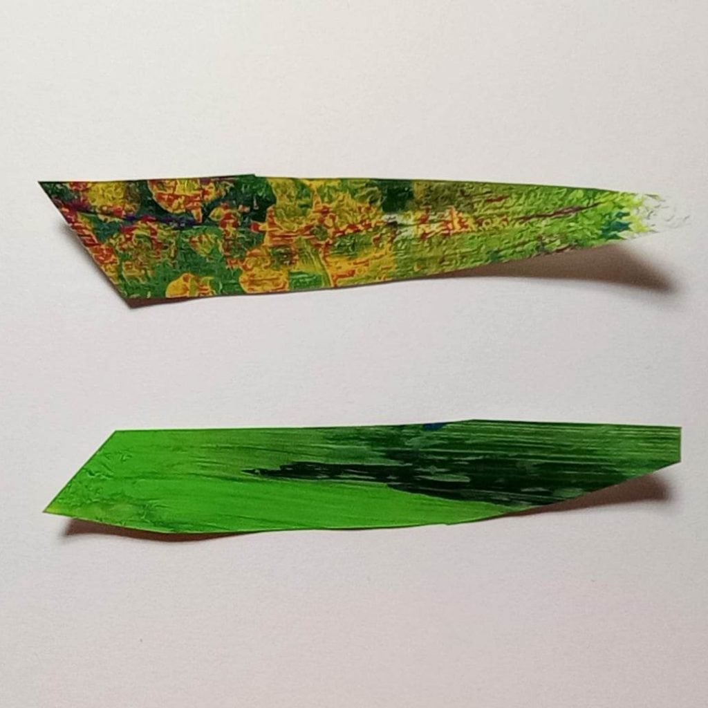
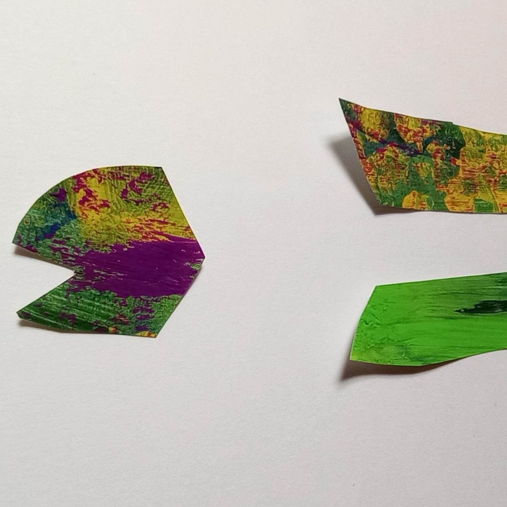
And painting our paper is a fun step. Check out how many different ways Eric Carle created different textures, and how he also created a cohesive look in his fish. He used predominantly greens in both of the referred-to schools of fish. Choose your color palette. And get out your other materials. First: paper.
Use what you have.
To demonstrate how you can use pretty much any old piece of paper, I used loose-leaf notebook paper and a piece torn from a newspaper page.
I made lines through the paint on my newspaper. I thought it would look good for fins, and be interesting with bits of text showing through.
On a whim I added in some leftover paint in a complementary color at the end… and loved the Monet vibe it gave.
The quicker you’d like to get to cutting and gluing, the thinner your paint should be. I hope you’ll have time to take some time to build some layers.
While your paint is drying you can get a better feel for how you want to lay out your page. Mine changed as I went, and I ended up deciding to not only make it horizontal, but to use two pages.
Time to journal
Did you enjoy books as a kid? Did you have favorites? Do you remember storylines or pictures better, or both? Write about your interaction with books when you were a child.
I don’t know about you, but I still love a well-illustrated children’s book with an engaging story.
Back to the art
What else would you like to include? In “A House for a Hermit Crab” Eric Carle used what appear to be simple wavy crayon lines to give the impression of being underwater. Anything you add beside your fish doesn’t have to be as complicated as the illustrations in the video. You don’t have to add anything at all. If you want to create a more detailed picture, there are many options, unlimited really. Have fun.
Whether or not it was an actual crayon, one way we can use crayon is in watercolor resist. Simply use a white crayon to draw some wavy lines, then go over with a watercolor wash in oceany colors. I didn’t end up using mine as a background because the blues and greens clashed with the blues and greens of my fish.
Which brings us back to our fish.
Bodies in his basic fish style require two vaguely triangular pieces that are angled at one end to leave space for a head. They need tails. And fins in whatever arrangement you’d like.
I used a white paint marker as the first step of my eye. Side note… I’m excited to be ordering my first set of Posca pens soon.
I’ll say it again, as I typically say, have fun with this week’s small art. And thank you for joining me for another week of the 52-Week Art Journal Journey. If you’re new here, check out the link to our Week 1 prompt, where we made our journals, and this journey, our own.
I appreciate the opportunity to encourage you to create a healthy habit of creative self-care through art journaling. I’ll be back next week with another prompt.


You May Also Like
Week 52: Artful Resolutions
What is the 52-Week Art Journal Journey?