Week 39: Autumn Color Mixing
One sunny Sunday afternoon last month I had some time to myself. I needed sunlight, and to make some art. So I took my watercolors and art journal outdoors to do some color-mixing inspired by a reel by Lacey Walker, @rebelunicorncrafts on Instagram.
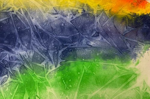
I used just two primary colors, yellow and blue, to see how many greens I could find between the two. It went pretty well, but with the watercolor subtle variation was difficult.
I played with and filmed using yellow and red indoors another day.
If you’d like to watch this week’s video before you read more, scroll on down…
Inspired by other color-mixing reels on Instagram, I also did a quick video of mixing complementary colors to make a muted autumn palette.
But it was not yet autumn on the calendar. And I hold on to summer as long as I can.
Now… well… the calendar says it’s fall. It’s also Week 39 of the 52-Week Art Journal Journey. Welcome!
I’m Melinda, and I’m here to encourage you to reclaim your creativity and establish a healthy habit of creative self-care through my simple form of art-journaling.
Fall-color color-mixing fun
While my Australian friends are heading toward summer, I’m trying to ignore the fact that my corner of the world is barreling toward winter. Though I do have to accept that my hemisphere has entered its three months assigned to fall, as have I. At least my body has, not my spirit.
But we’re doing some fall-inspired art this week.
At first this fallish color-mixing was just going to be completely my own take, but I have to give credit to one of my Instagram favorites, Andrea Nelson, for where I ended up going with this one.
We’ll start with blobs of our traditional leaf colors that I have in my basic eight-color Crayola watercolor set… because, as I so often say, reclaiming your creativity doesn’t need to cost a lot. We’ll also use the more summery green.
If you use your art journal horizontally for this, it’s perfect for our four color blobs.
Then we’ll experiment with what happens when we mix complementary colors, and how we can use them to make a lovely fall color palette.
We’ll start our experiments by putting some red, orange, yellow, and green in the lid of our paint tray, or whatever mixing tray you use for watercolor, giving each plenty of room.
To our red we’ll add a bit of its complementary color: green. Then use our new color to paint a blob beneath our red.
Next we’ll repeat the process with our orange and its complement, blue.
Then yellow and purple.
Be sure to not add too much of each of your complementary colors to your original.
After yellow, we’re at our green, which is the complement we added to red. But in our first mixing we started with red, and added a small amount of green. Now we’re starting with green, and adding a small amount of red.
Different ratios create different colors.
I didn’t quite get a ratio I loved with my orange and yellow, so I tweaked them a bit and added a couple of spare blobs on the facing page above my original colors.
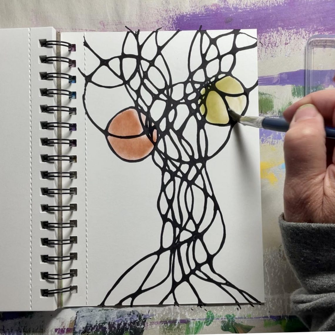
After they were dry, as Andrea Nelson would, well, as she did, I transformed my blobs into cute trees.
Adjust your mixes as you see fit. Feel free to play with your mixes longer.
You can even create your own forest if you’d like. I think I’ll do that this week, and share a process reel on social media…
Extending the fall-color antidepressant fun
I saw another Andrea Nelson reel and decided to use an autumn tree as inspiration, as I recently did a monarch butterfly wing, for another funky small piece of neurographic art.
Start your Sharpie (or Micron pen, or whatever other black waterproof implement you have) lines wide apart at the top of a vertical page for your treetop, narrowed close down through a trunk, then wider across the bottom of your page. As with the other neurographic art I’ve done with you, keep your lines wavy and definitely don’t stop them from crossing.
Find some small round objects to trace for circles in your treetop.
Then it’s time for the relaxing, get-your-mind-out-of-spin-cycle softening of all those pointy crossings….
After you’ve enjoyed the neurographic step of this week’s small art, use some autumnal mixes to paint each circle. Start with ones that don’t touch. Then paint the overlapping circles after the others are dry.
If you watch the video, you’ll see I have stray bits of color on all of my fall-color art. I have a cat to “thank” for that.
This week’s journaling prompt
Did you notice there wasn’t a writing prompt last week?
This week our prompt is autumn, and the changing of the season.
The transition from summer to fall used to be far harder for me. Every year its approach made me feel like I was literally dying.
If you struggle with the end of summer and seasonal affective disorder, know that art is one tool you can use to combat the depression.
I mentioned in last week’s email how some times we most need to make art are the hardest to make it.
But it’s worth it.
Taking the time to make art isn’t a waste of time. It’s an effective antidepressant.
And as we in the northern hemisphere continue to have shorter days, less sunlight, colder temperatures, it just make sense to take time for things that make us feel better.
So enjoy some color-mixing and neurographic art.
And look for the beauty even in the things you don’t enjoy.
It has been hard too many years for me to truly enjoy the beauty of autumn, because its so brief and it means that the hardest time of year is coming. It means the cold is coming, and along with craving sunlight, I hate feeling cold.
But I am also living proof that art helps.
Art helps our brains battle depression. And anxiety.
So, as I said, enjoy this week’s small art.
And take some time to think about how this season affects you. How changes in the season affect your mood.
Being aware is the first step in dealing with something.
Keep making time for art.
And than you for the opportunity to encourage you to take time for art.
More art inspiration
Click here to check out Lacey Walker on Instagram.
Click here for Andrea Nelson.
And guess what?!? You can find me somewhere new on Instagram! Click here to check out and follow Better with Art, my new home for creative self-care content. You can still find me in the same place, but things were getting a little messy, so Better with Art will be specifically creative self-care, including workshops that are… in the works… and I’d love to see you there! If you already follow me as myself, you’ll want to stick around there, too, as I’ll continue to share 52-Week Art Journal Journey content for the rest of 2023, and my art and art inspiration, including prints and new product lines I’m excited about as they become available into the new year and beyond. If you don’t follow me there yet, click here.
Keep making art, Friends! If you’ve been away from it and ignoring its benefits, now is the perfect time to start again!
If you’d like some no-more-than-weekly creative self-care encouragement in your inbox, click here to sign up for emails from me. You’ll also receive an invitation to join the small and private Art Journal Journey Facebook group.
Remember you art journal is as private as you want it to be, the perfect place to express yourself and experiment without worry about what others will think. But I’d love to be able to encourage you in your art-making, and this group is the perfect place to be encouraged and encourage others on this journey.
If you decide to share any of your 52-Week Art Journal Journey small art on social media to encourage others to practice creative self-care, I’d love to see it! Tag me… @melindavanry on Instagram. You can also use #artjournalwithmelinda.
I’ll be back next week with another small-art and journaling prompt. In the meantime, enjoy some color-mixing fun, and relax with some neurographic art.